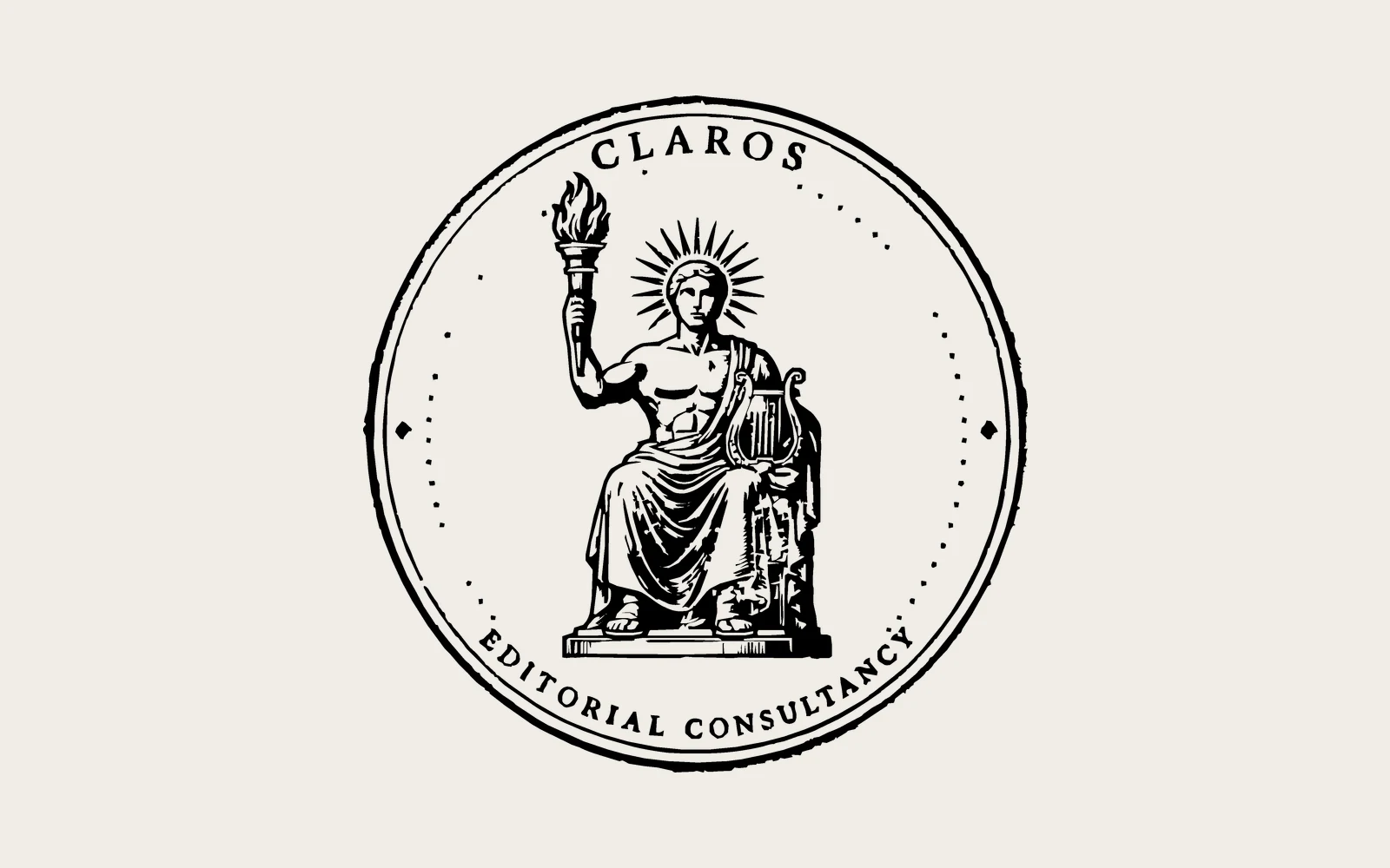
Logo design for an editorial firm.
A stamp-style seal for an editorial consultancy whose name comes from an ancient prophetic shrine of Apollo, with Apollo at the centre.
The brief
Claros is an editorial consultancy whose name comes from a real place: an ancient prophetic shrine of Apollo in western Turkey. The client wanted the logo to reflect that origin directly, with a depiction of Apollo as the central figure.
Specific direction was given on the figure: male, bare-chested with robes, seated toward the viewer, one hand holding a torch and the other a lyre.
The approach
Built in Adobe Illustrator. The direction on the figure was clear, so the work was interpretive: translating a specific mythological reference into something that functioned as a logo rather than an illustration.
The result is a stamp-style seal with Apollo at centre, rendered in a woodcut-influenced style with the company name set in spaced capitals around the perimeter. Delivered in both light and dark versions.
Outcome
A logo that carries genuine symbolic weight without being decorative for its own sake. The seal format gives it authority. The monochrome treatment keeps it flexible across applications.